Back to School and My First Alteration

Back to School and My First Alteration

It’s the middle of August and, according to the Internet, Back to School time.

It’s the middle of August and, according to the Internet, Back to School time.

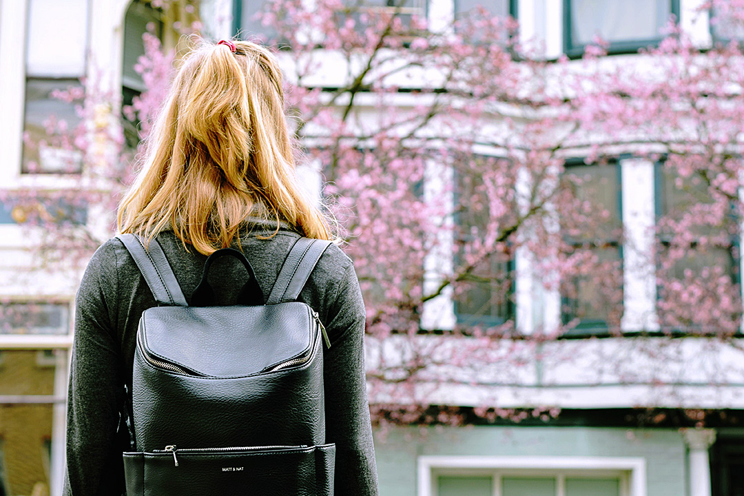
I was such a geeky, nerdy kid that I always loved going back to school in the fall. And I always liked autumn clothing better than summer clothing. Probably because I have a soft spot for anything plaid and earth toned, both of which tend to be predominate in fall fashions.

Turn back the clock


I grew up in the 70s and 80s when J. C. Penney and Sears still put out their big book catalogues. I spent hours going through those, ear marking the pages that pictured the clothing items I most wanted. We never actually ordered anything from the catalogues. My mom was a big proponent of in-person shopping. Even to this day, she’s not so keen on ordering things from the internet.

Instead, on a Saturday or Sunday in August, she’d load all four of us kids into the van for a trip to Midway Mall or, if we were feeling fancier, Great Northern Mall. Midway Mall is in Elyria, Ohio and it had a Penney’s and a Sears. (I suspect it still does.) Great Northern Mall is in North Olmstead. We always thought of it as being a bit more high end the Midway Mall though I have no idea if that was true or not. Great Northern had a Penney’s and Sears as well but, it also had a Macy’s.

I would spend hours searching the racks for the garments I had identified in the catalogues, or something as similar as I could find. Then I’d try on a pile of clothing in the dressing room. I always wanted much more than Mom’s budget would allow so then I’d go through a lengthy editing process until my choices added up to what Mom was able to spend. Every year there was one thing I desperately wanted that Mom didn’t want to buy for me because she thought it was too trendy and I’d lose interest in it after a month or two.

Every year there was one thing I desperately wanted that Mom didn’t want to buy for me because she thought it was too trendy and I’d lose interest in it after a month or two.

Every year there was one thing I desperately wanted that Mom didn’t want to buy for me because she thought it was too trendy and I’d lose interest in it after a month or two.

Pin striped adventures

When I was 12 or 13 and in junior high school, I was obsessed with pin striped pants and ties. Mom agreed to buy me one pair of pin striped jeans but told me if I wanted any more, especially the wide legged, pleated pair, I’d have to figure out how to make them myself. As for the ties, she had some old ones from her father I could have.

I had no idea at this time how to go about making a pair of pants. I also didn’t happen to have any pinstriped fabric lying around.

But my Dad did, at least he had some pinstriped pants shoved deep into his closet that he never wore. The pair I liked the most were rust and brown and one Saturday afternoon when both he and my Mom were at work, I extracted them from the closet.

They were, of course, humongous on me but I knew how to sew so I figured I could alter them to fit. I was afraid that someone would come home and stop me mid alteration so I didn’t bother taking anything apart first. I just started adding pleats to the waistband, two to each side that I topstitched all the way down the legs. Then two in the back. I chopped off the hem, unintentionally rendering the pants capri-length. When I put them on, I decided the capri-length made them more fashion-y and I was going to wear them to school the next day.

Zero photo evidence

I wish there was a photo of me in these pants but there is not.

I wish there was a photo of me in these pants but there is not.

I wish there was a photo of me in these pants but there is not. I did put them on Monday morning, along with a brown turtleneck, a brown belt, and my flat brown capezio lace up shoes. The pants were bulky since I hadn’t trimmed any of the fabric out when I altered them and the legs stuck out because of the same but I thought they looked cool. When I walked into the kitchen, my Mom did a double take. She opened her mouth to say something then closed it again. I waited for her to yell at me or, worse yet, to give me the “I’m so disappointed in you” look.

But, instead, she stifled a laugh and said, “Well that explains why there was brown thread all over the sewing room. Next time, you really should trim out some of the excess fabric. That waistband wouldn’t be so bulky then.”

“You’re not mad?” I asked.

I’m not. I’ve been telling your father for years to get rid of those pants. But we should probably ask him if it’s ok.”

And there marked a three or four year period of me altering my father’s 1960s clothing to fit me. My mom was happy that I didn’t ask her to buy me as much at Penney’s and Sears. I was happy that I had clothes that were not like everyone else’s. And my dad was just happy that me repurposing his old trousers gave my mom one less thing to nag him about (my father was never very good at throwing “perfectly good” old items away).

I don’t know what the other kids at school really thought about my vintage dad wardrobe. I was already considered weird before I started donning old pinstriped pants so I suspect it just solidified that sentiment. I am, though, forever thankful to my parents for letting me develop my own little bizarre fashion style, and for encouraging my sewing habit.

Whoever would’ve thought it would turn into a lucrative career.

Color Theory for Quilters

Color Theory for Quilters

Color Theory for QuiltersColor theory and scheme play an essential part in any design, and color choices are most important in planning any quilt. Choosing a color scheme that works for your quilt prevents muddy color or boring results from your hours of work.  You want quilts that both stand out and fit in, and the key to this is using color theory to your advantage. Using colors that work together as a quilting team in your design can enable you to do any or all of the following:

  • Achieve harmonious results using a wide array of many fabrics
  • Make some colors pop and others recede, to emphasize or unify block patterns
  • Design quilts to complement interiors without any clash, and without being boring
  • Have backgrounds that work well, rather than as competition to spoil design effects
  • Balance any design and make all your quilts sing
  • Add extra Oomph and Wow Factor, for perfect success

You can do all this with ease when you understand color theory and recognize the logical choices available.  We don’t have to reinvent the wheel, and so we can choose from a preselected menu of color scheme styles, or teams, that we know will always work wonderfully together.

The Color Wheel

Color theory and schemes

What are some of these tried-and-true color teams? Let’s look at them all:

Monochromatic

A monochromatic color scheme uses only one color, choosing from all shades and tones of that color. How many greens are in the garden, and all of nature? It feels like shades of blue are unlimited when you think of the many colors for sky and sea.  The brown palette includes all colors of dirt and soil layers, skin tones, fur shades, tree barks, and more. You could use hundreds of different fabrics in one quilt and stick to one color. Or limit yourself to less, if you like, but know that a monochromatic quilt is a viable option in any color. You can also use a monochromatic palette as an element of your quilt, rather than the whole thing. This trick will enable you to paint with your fabric and achieve dramatic landscapes or picturesque quilts.

Analogous

Analogous colors are next to each other in the color wheel.  You can choose a narrow or a wide analogous scheme. You could choose to use all shades of just red, orange, and what is between them, or include all the way to yellow for more contrast. Choose from the other side of the wheel using blues and indigos, or including violets. Or go with yellow, green, and blue, including everything in between them, or blue, purple, and red with shades in between these. There are a lot of options for analogous quilts. I made one using blues and indigo, I showed how to make it on this blog a while ago.

Complementary

Complementary colors really set each other off.

Complementary colors really set each other off.

Complementary colors are opposites on the color wheel. They go well together as natural pairs and seem to reflect their differences pleasingly. Complementary pairs are: red and green, blue and orange, yellow and purple, and more.  Indigo is between blue and purple, so its opposite shade is between yellow and orange. You could also choose two analogous colors and also use both color’s complementary colors. For example, I have never used indigo and violet with yellow and orange yellow as a color scheme, but I know that it would work well.

Triadic – primary, secondary and tertiary

The familiar primary color scheme of red, yellow, and blue is triadic. Triadic colors are evenly balanced and play well together without competition. The secondary triadic trio includes green, purple, and orange. Tertiary triads include indigo, red-orange, and yellow-green together, or yellow-orange, blue-green, and violet red. Remember that you can choose from different shades of each color. For example, the familiar pastel trio of pink, pale yellow, and light blue used so often for babies, is a just a lightened up version of the primary color triad.

This rainbow book of colors is one of my favorite gifts ever.

I used a Rainbow color scheme for the cover of this baby color book.

Rainbow

The rainbow color scheme includes, you guessed it, every color of the rainbow. Don’t leave any out; a rainbow palette must include red, orange, yellow, green, blue, indigo, and purple. You can decide for yourself whether to include the tertiary colors that fall between these or not. A rainbow scheme will work with or without these colors. A rainbow scheme always results in a vibrant quilt.

Warm and cool

Warm and Cool

Warm and Cool.

Warm colors range from red to yellow, like the colors of the sun. Browns and sands are included in this group, too. Cool colors go from blue-green to purple, like the seas and the skies, including at night. Warm colors advance; cool colors retreat. Cool colors separate and warm colors unify. Stars pieced from warm colors really pop against a cool background.  Pairing warm and cool colors differently can make dramatic differences in blocks, and changing this up may provide a lot of interest in repeating motifs.

Light and dark

This is the ultimate contrast, like black and white. Shapes are emphasized and the look is simple and uncluttered. Use your choice of colors for the light and dark pairing. You could choose light and dark shades of the same color or a complementary pair to contrast between light and dark, for example. While black and white can be starkly dramatic, this can also be downplayed in a light/dark combo by choosing a mix of lights and darks and gradating the tone.

Neutral

Natural colors: the seashore and shells; barks and stems; wood; dried grasses; crinkly leaves; skin-tones; rocks and soil. Grays like the sky sometimes and clouds, or concrete, and silvery steel. Creams, ivories, bone, and every shade of brown are all neutral colors. Neutrals can be light or dark. They are non-competitive, and help other colors. This is why they work so well as backgrounds. Neutrals are peaceful and offer support, so in general they are always welcome.

Traditional

A traditional quilt color scheme depends less on color than value. It is traditional to choose three colors for quilting: one that is dominant, one that is subordinate, and one as an accent. The dominant and subordinate colors play off each other, and the accent provides a pop. The red squares traditionally used as the centers of Log Cabin blocks both provide pop and serve to unify and define this classic design. You can use your dominant color to emphasize a repeating motif and the subordinate color as the background, sprinkling the accent color about to add sparkle and interest.

Scrap bag

It is a valid choice to use no color scheme at all and choose indiscriminately from among a plethora of colorful scraps. Scrap quilts, with their confetti of riotous colors, are endlessly pleasing, both to make and to look at. You can piece together a pleasing string or strip patchwork quilt by choosing blindly from an abundant scrap pile.

Choose a variety of fabrics

Color Theory for QuiltersYou can use a favorite fabric as a starting point to choose your scheme around, or you can begin choosing fabrics according to a predetermined scheme. The unlimited choices available to quilters are a big part of what makes quilt-making fun. You can increase your enjoyment in making any quilt by widening your variety of fabric choices. If you choose a triadic color scheme, for example, but then choose only one fabric of each color to complete your quilt, you may be bored by the lack of variety.  Choose several fabrics in each color to increase interest instead.

Don’t be daunted by color choices. Choose any one of these color schemes and your quilt is sure to be a success. I hope that you understand color theory now and that this has helped you.